This text is the continuation of this one: How I create characters: a practical guide for illustrators – Part 01
If you haven’t read it, read part 1 first and then come back here to start reading this second part.
Facial expressions and body language: bringing characters to life
Think about the people around you — depending on their personality, they’ll sit, walk, or smile in very specific ways. The same should happen with your character. It’s a good idea to ask yourself:
- How would my character behave?
- How does he/she walk?
- Is he/she more serious or silly?
- Is he/she usually cheerful or more on the gloomy side?
- What’s his/her body language like?
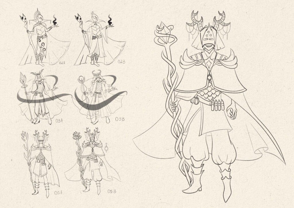
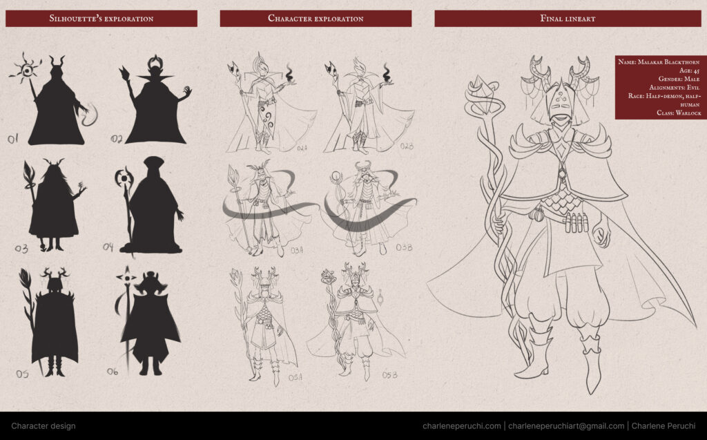
In my case, I didn’t do this step for Malakar, but I had already drawn his lineart in a pose that reflects his fearless, powerful, and slightly superior attitude.
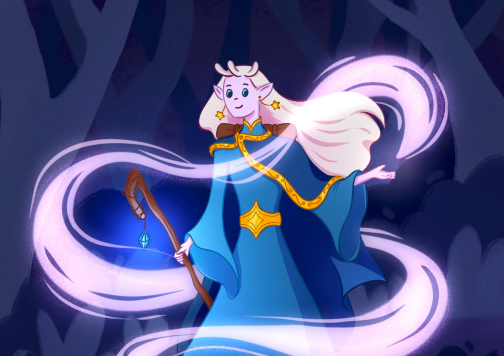
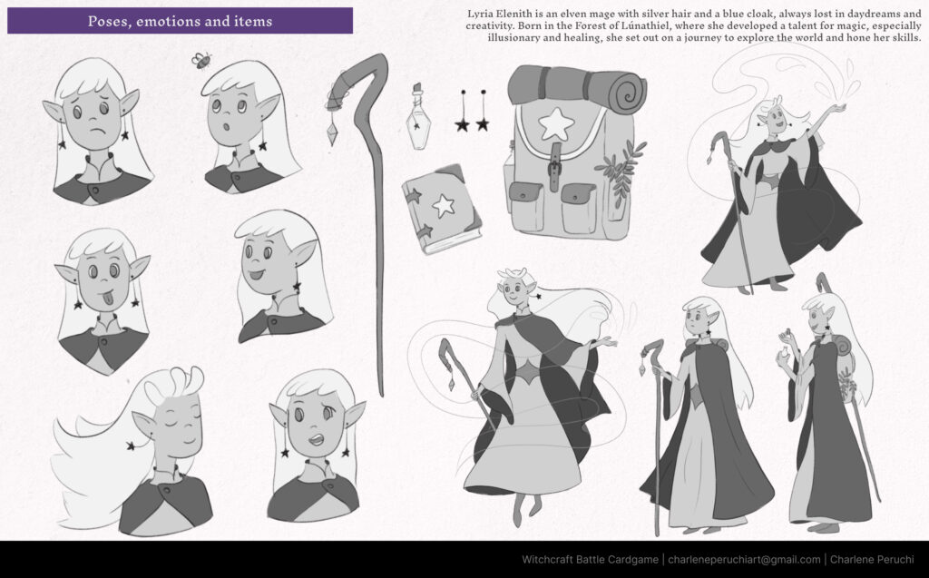
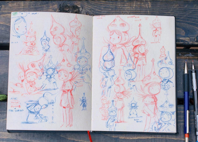
For Lyria, however, I created a full sheet of poses and facial expressions. She’s a more laid-back and fun character — even a bit silly at times — so I made sure her poses reflected that personality.
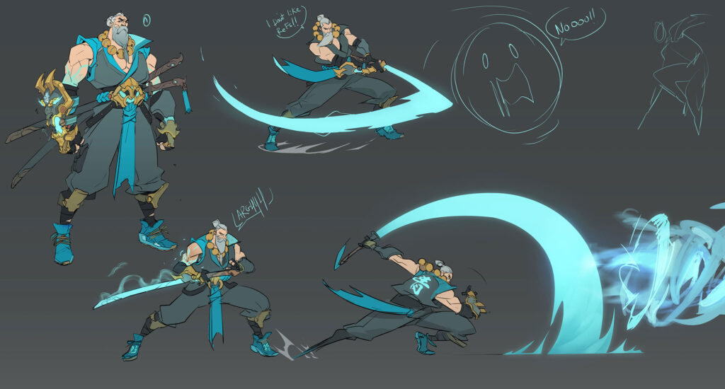
Of course, these are just a few of the many poses you can create. Here are some other examples that showcase different personalities through body language:
Adding details: clothing, props, and color choices
We’ve already talked a bit about accessories and clothing, but I want to dive a little deeper here because they play a huge role in storytelling. Just by comparing Malakar and Lyria’s outfits, you can tell that their personalities, intentions, and goals are very different.
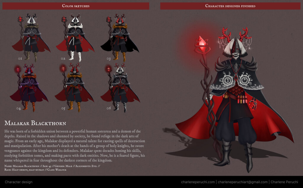
Malakar wears heavy, protective clothing made of metal and dark leather. He has magical potions on his belt and even a metal mask covering part of his face — everything about him communicates danger and mystery.
Lyria, on the other hand, wears comfortable clothes for traveling. She’s equipped for cold or sunny weather and carries a backpack filled with practical items like healing potions, herbs, and a notebook full of her observations.
Both characters carry staffs, but even the design of their staffs tells you something about their personalities.
Color to enhance storytelling
Color is another powerful storytelling tool. Malakar’s color palette is black, red, and white. Red evokes danger and blood, black symbolizes evil or darkness, and the white in his cape and hair adds a mystical contrast
Lyria’s colors are blue, gold, white, and brown — giving her a more celestial, magical feel. She looks like someone who uses magic for good.
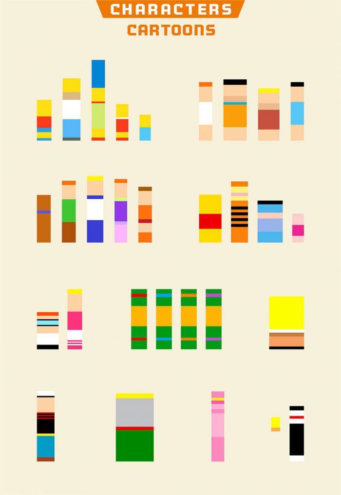
A great example of how color communicates emotion is in the movie Inside Out. Each character has a color that reflects their emotion: blue for Sadness, red for Anger, and so on.

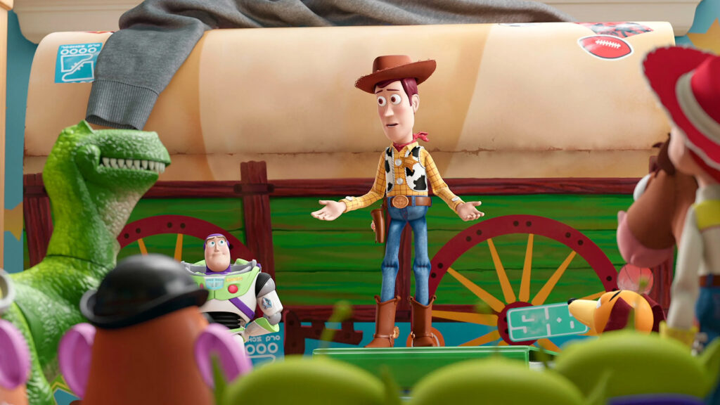
But besides emotional meaning, it’s also important to use harmonious color combinations. For example, in Toy Story, Woody wears blue, yellow, red, and brown — an analogous palette (yellow, red, and brown) with a touch of complementary contrast (blue).
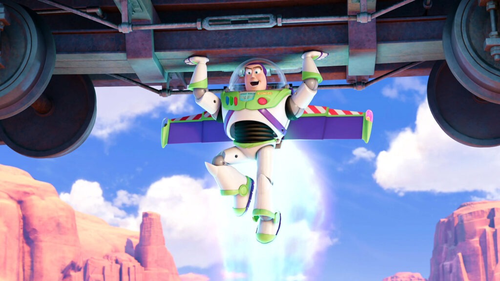
Buzz Lightyear uses a similar approach with green, blue, and purple as an analogous scheme, and red as a complement. The white in his suit helps balance everything visually.
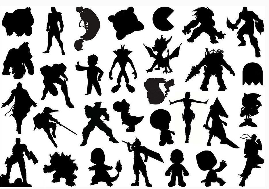
Silhouette and color are two of the most visually impactful elements in character design.
You might’ve seen those fun exercises where you’re asked to guess the character based only on their silhouette or color palette.
To help with color choices, you can create a quick color sketch. I did this for Malakar. Even though I had a base palette, I played around with different ways of distributing those colors, and even tested some variations. This step is super useful — it can save you a lot of repainting later!
Final tips for developing your unique character design style
As you can see, designing a character involves several steps. This process is essential to developing and refining your idea. Sometimes we have a general image of who a character is, but it’s only by going through all these stages that we truly give them depth — crafting a visual that tells their story and reveals who they are.
In the world of children’s books, it’s very common to see expression and pose sheets, for example. Some illustrators, like Beatrice Blue, start their process by playing with simple shapes — stretching, squashing, and bending them to discover fun silhouettes.
There’s no one-size-fits-all formula. You can adapt the character design process however you like, so it fits your creative flow.
Before we wrap up, here’s a quick recap of the steps I follow when creating characters:
- Moodboard: gather and organize references;
- Silhouette exploration: use geometric shapes that match your character’s personality;
- Lineart with details: think about who your character is and add meaningful elements and clothing;
- Poses and facial expressions: explore how your character behaves and feels;
- Color: use colors to tell your character’s story and emphasize their traits.
I hope this gave you a clearer view of how I approach character design.
Do you follow a similar process when creating your own characters? Have you ever created a character based on the personality of someone you know?
Thanks so much for reading!
Charlene ⭐